
Activity 3: investigating colour
Introduction
After observing the effect of mixing and aligning colours, students decide which one of the four colour schemes they will use to surround their likeness, as the background of their self-portrait drawing.
Resources
- Paintbrushes and paint rollers
- Paint in warm, cool, complementary and analogous colours
- The following images:
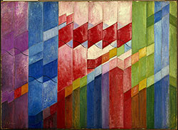
Arrested phrase from Haydn Trio in orange-red minor, 1919–35
Reproduced courtesy of the National Gallery of Australia, Canberra
Artist: Roy de Maistre
-
Activity stepsShow details
Colour wheel
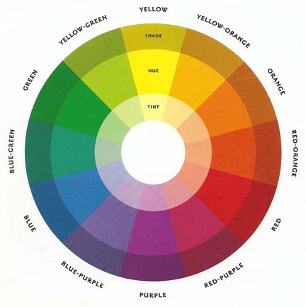
- Using a colour wheel explain relationship of colours to each other and discuss how colours can be mixed or aligned to produce a particular effect.
- Discuss the following four colour schemes.
- Warm colours: Generally, warm colours are the primary colours red and yellow, and the secondary colours that are a mixture of these, making the colour orange. A range of warm colours can be obtained by mixing various quantities of red and yellow, for example, tangerine, which is predominantly yellow mixed with red. Warm colours can also be made using blue, with the dominant mixer red or yellow, making colours such as maroon (red with a little blue) or lime green (yellow with a little blue).
- Cool colours: Blue is the primary cool colour and other cool colours are generally derived from blue. In colour mixing, blue is the dominant colour used to maintain a cool colour scheme. Colours such as aqua (blue with a little yellow) or purple (blue with a little red) are also cool colours.
- Complementary colours: Complementary colours are primary and secondary colours that are opposite each other on the colour wheel, for example, red and green, blue and orange, yellow and purple. They have the greatest contrast and maintain their intensity when placed next to each other.
- Analogous colours: Analogous colours are primary and secondary colours that are next to each other on the colour wheel. Examples are yellow, green and blue; blue, purple and red; red, orange and yellow.
Colours, tints and shades
- Colour is a visual device that can be used to contribute elements such as balance, contrast and emphasis to the design and composition of an artwork. Colour can contribute to the communication of meaning in an artwork.
- Examine and discuss the artwork Arrested phrase from Haydn Trio in orange-red minor, created by Roy de Maistre in 1919–35.
Arrested phrase from Haydn Trio in orange-red minor, 1919–35
Reproduced courtesy of the National Gallery of Australia, Canberra
Artist: Roy de Maistre - Ask students questions such as the following
- What is the style of this painting? Identify some of the features in this painting that influence your decision.
- The artist has used primary and secondary colours. Name and categorise the colours.
- Tints and shades have also been used. What is a tint and a shade, and what is the difference in how they are mixed?
- What studio management techniques should you use when painting and mixing colours to keep them clean and different?
- Prepare students to experiment with mixing secondary colours, tints and shades. Have them paint strips of the four colour schemes to see the impact of colours next to each other. They should be aware of effects such as the following.
- Complementary colours have an intensity when they are placed directly next to each other. Our eyes can see a 'vibration' at the point where the two colours meet: orange and blue, yellow and purple and red and green. Complementary colour schemes are strong. The darker complementary colour can be used as the shadow or be behind its partner to keep the colours bright, rather than using black or dark grey.
- Analogous colours have a blended appearance, with colours moving from one to the other in more rhythmic way. Some analogous colours are: blue and green, green and yellow, yellow and orange, orange and red, red and purple, purple and blue.
- Warm colours are generally red, orange and yellow. They are associated with giving the visual impression of warmth, heat or excitement.
- Cool colours are generally blue and green. They are associated with giving the visual impression of coldness or serenity.
- Tints and shades of the colours can be mixed using white and black. Tints and shades will alter the impact of colours in the selected colour scheme. For example, in a complementary colour scheme, adding red to white makes pink which will no longer have the intensity alongside green. Adding black to blue will make a darker colour that will fit into a cool colour scheme.
- Colour mixing, using different quantities of the primary colours, will give a range of secondary colours. For example, when mixing purple, begin with red and mix in thoroughly a small amount of blue for a maroon, then continue with a little more blue for a deeper purple. Or begin with blue and mix in thoroughly a small amount of red for violet, then a little more red for another variation of purple.
- Students practise painting using different sized paintbrushes and paint rollers to achieve the desired effect. They should plan for drying time and storage.
- Students review the colour schemes and select several to practise painting the three or four pencil line drawn images completed in Activity 2.1.